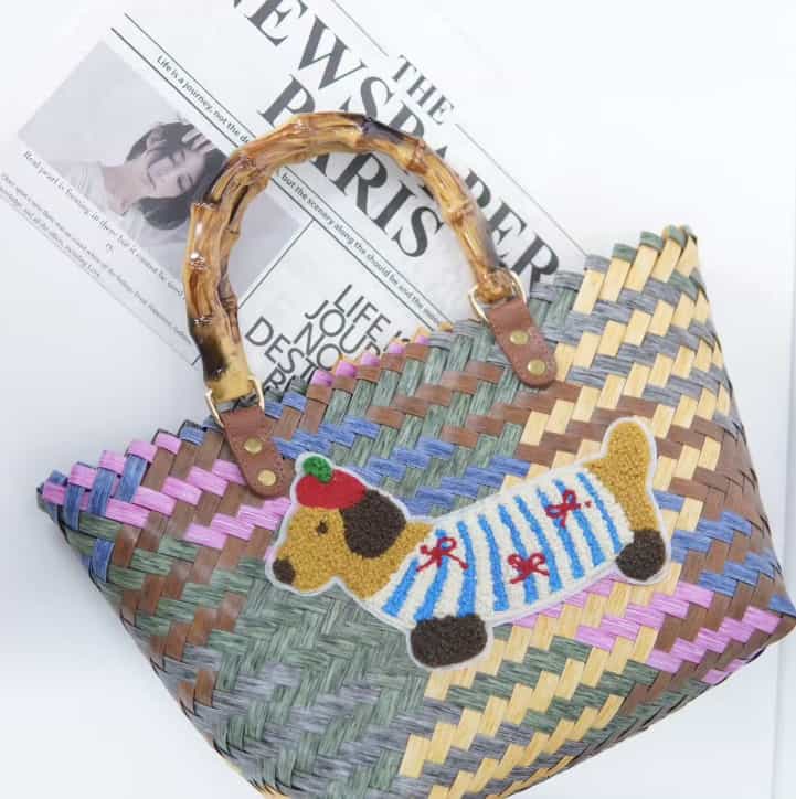
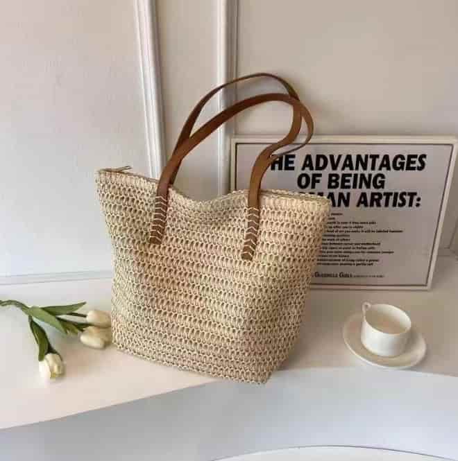
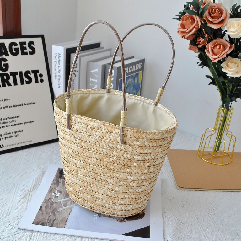
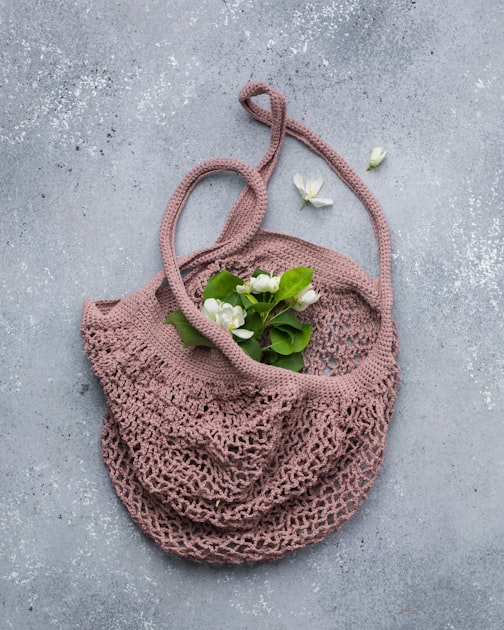
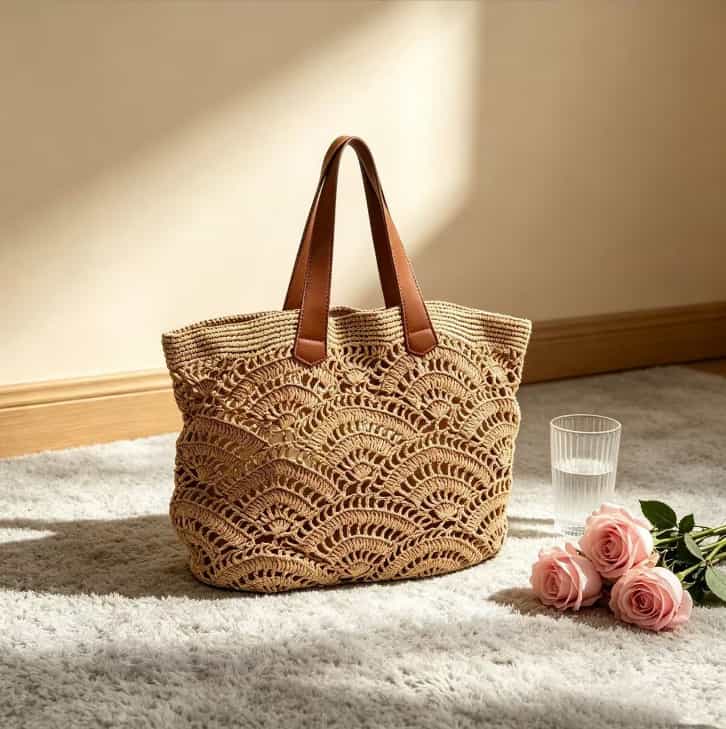
Here’s something I’m seeing across the board this season — the color palette for raffia bags has shifted.
Gone are the days when raffia meant only one thing: natural beige. Don’t get me wrong — beige is still everywhere. But 2026 is bringing richer, earthier tones into the mix. Think terracotta, olive green, warm caramels, and sun-bleached neutrals that feel more sophisticated than the aggressively bohemian raffia bags that flooded retail in previous years.
If you’re a wholesale buyer planning your summer inventory, this is worth paying attention to. Let me break down the three colors that are leading the charge — and why they matter for your store.
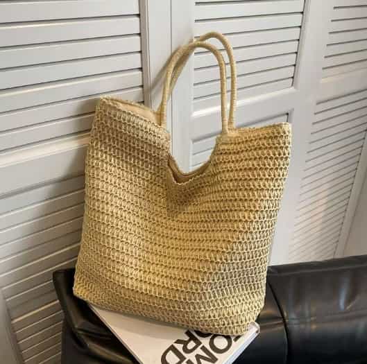
The 2026 Raffia Color Palette – What’s Changed?
Raffia bags have officially graduated from beach-only territory. Fashion editors are now pairing woven bags with tailored trousers, silk pants, and structured pieces — and the color palette has evolved to match.
What’s driving the shift:
- Luxury brands are leading the way – Stella McCartney’s “Summer of Love 2026” collection introduced Natural Teak colorways with richer earthy browns, faded clay tones, and sun-bleached neutrals. Chloé’s Summer Banana collection offers Summery Beige, Clay Brown, and Tea Leaf Green.
- Street style is following – The “wrong-bag theory” is making raffia feel modern instead of boho. The contrast between something refined (tailored clothing) and something natural (a textured raffia bag) is exactly what makes the look work.
- Color options are expanding – Warm caramels and earthy neutrals are leading the way alongside classic naturals. Brands are offering everything from Burnt Orange and Deep Blue to Grass Green and Popping Yellow.
The bottom line: Raffia isn’t just one color anymore. If you’re stocking only natural beige, you’re missing the bigger opportunity.
What Are the 2026 Color Trends for Raffia Bags?
The raffia color palette for 2026 has expanded far beyond traditional neutrals. While natural beige remains a staple, several new color directions are emerging.
The 2026 color landscape:
| Color Direction | Examples | What It Says |
|---|---|---|
| Classic Naturals | Beige, sand, honey, ecru | Timeless, safe, wide appeal |
| Warm Earth Tones | Terracotta, clay brown, natural teak | Premium, grounded, sophisticated |
| Rich Dark Tones | Brown, black, navy, burgundy | Year-round appeal, city-ready |
| Summer Brights | Turquoise, cobalt, lemon yellow, strawberry red | Statement-making, photogenic, younger shoppers |
| Soft Pastels | Butter yellow, peony pink, mint green, lavender | Fresh, playful, fashion-forward |
Why Beige, Terracotta, and Olive Are the 2026 Must-Haves
Three colors are standing out as the key shades for raffia bags this year: beige, terracotta, and olive.
Beige – The Safe Bet
Beige is still the best-seller because it works with everything. It never looks dated, appeals to the widest audience, and carries the least inventory risk. Chloé’s Summery Beige is one of the key color options in their Summer Banana collection. For wholesale buyers entering the category, beige is the safest place to start.
Terracotta – The Premium Upgrade
Terracotta feels richer and more intentional than beige. It’s warm, earthy, and fits the “quiet luxury” trend perfectly. Stella McCartney’s collection features “faded clay tones” that are moodier and more sophisticated than traditional summer brights. If you already stock beige, terracotta is the natural next step.
Olive – The Differentiator
Olive is unexpected but wearable. It reads as a neutral, not a statement, which makes it versatile without being boring. Chloé’s Tea Leaf Green is a key option in their Summer Banana collection. Not every retailer carries olive, so it sets your stock apart.
The bottom line: Beige covers the masses. Terracotta adds warmth and premium feel. Olive differentiates your brand. Stock all three to appeal to every customer segment.
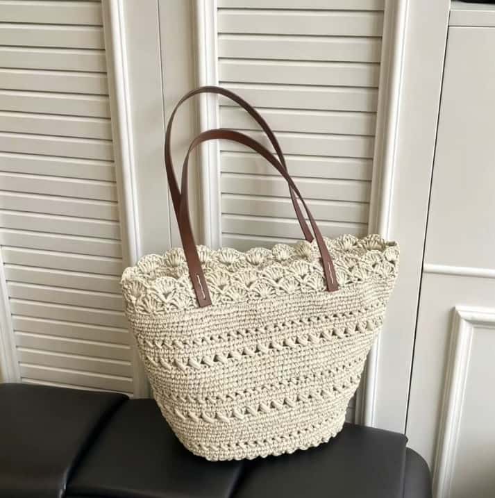
Beige – The Timeless Classic
Let’s start with the obvious one — because it’s still the best-seller for a reason.
Beige raffia bags are the safe bet. They work with everything, they never go out of style, and they appeal to the widest range of customers. Chloé’s Summery Beige is one of the key color options in their Summer Banana collection.
Why beige works:
- Versatility – Goes with every outfit, from linen dresses to tailored suits
- Timelessness – Never looks dated or trendy
- Wide appeal – Attracts the broadest customer base
- Easy to stock – Less risk of leftover inventory
What to order: If you’re new to the category or want a safe entry point, beige is your answer. A medium structured tote in natural beige with leather trim is the top seller across multiple price points.
Pro tip: Look for beige with subtle variations — sun-bleached or natural teak tones that feel more premium than flat beige.
How to Choose the Right Beige for Your Store
Beige isn’t just beige. There are shades, undertones, and finishes that make a big difference in how the bag sells and who buys it.
What to consider when choosing beige:
- Your customer base – Younger shoppers tend to prefer lighter, sun-bleached shades. Older, more classic customers often lean toward natural teak or warm beige.
- Your existing inventory – If you already stock white or cream bags, add a deeper beige like natural teak. If your stock is mostly dark colors, go lighter.
- Price point – Premium beige finishes (like natural teak) often feel more expensive. If you’re selling at a higher price point, natural teak supports that positioning.
Common beige shades for raffia bags:
| Shade | Description | Best For |
| Natural beige | Classic raffia color — light, warm, slightly golden | Wide appeal, safe entry point |
| Sun-bleached | Lighter, almost white-leaning beige | Beachy, resort, lighter summer looks |
| Natural teak | Deeper, richer beige with brown undertones | Premium positioning, transitional seasons |
| Warm beige | Slightly yellower undertone | Paired with gold hardware, warmer skin tones |
| Cool beige | Greyer undertone | Paired with silver hardware, cooler skin tones |
What to order:
| Your Situation | Recommended Shade |
| First-time raffia buyer | Natural beige — safe, sells to everyone |
| Already stock natural beige | Natural teak — expands your range without risking a bright color |
| Selling at premium price points | Natural teak or warm beige — look more expensive |
| Targeting younger customers | Sun-bleached — feels fresher and more modern |
The bottom line: The shade you choose affects who buys the bag. Match the shade to your customer base — not just what looks good on a screen. Natural beige is the safest bet for most stores. Natural teak is the next step up.、
Which Beige Shade Should You Stock? – A Quick Guide
Not all beige is the same. Here’s how to choose the right shade for your customer base.
Common beige shades for raffia bags:
| Shade | Description | Best For |
|---|---|---|
| Natural beige | Classic raffia color — light, warm, slightly golden | Wide appeal, safe entry point |
| Sun-bleached | Lighter, almost white-leaning beige | Beachy, resort, lighter summer looks |
| Natural teak | Deeper, richer beige with brown undertones | Premium positioning, transitional seasons |
| Warm beige | Slightly yellower undertone | Paired with gold hardware, warmer skin tones |
| Cool beige | Greyer undertone | Paired with silver hardware, cooler skin tones |
What to stock based on your customer base:
| Your Customer Type | Recommended Shade | Why |
|---|---|---|
| General audience | Natural beige | Safe, sells to everyone |
| Premium/luxury | Natural teak | Looks more expensive |
| Younger shoppers | Sun-bleached | Feels fresher and more modern |
| Fashion-forward | Cool beige | Subtle, trend-driven |
| Resort/beach | Sun-bleached | Light, airy, beachy feel |
The bottom line: The shade you choose affects who buys the bag. Match the shade to your customer base — not just what looks good on a screen. When in doubt, natural beige is the safest bet for most stores.
How to Photograph Beige Raffia Bags for Online Sales
Beige is tricky to photograph. Here’s how to make it look true to life.
Photography tips for beige raffia bags:
| Tip | Why It Matters |
|---|---|
| Use natural light | Beige looks different under artificial light — natural daylight shows the true color |
| Include a white balance card | Helps you correct color in post-production |
| Show it against different backgrounds | White, sand, and wood — shows how the color works in real life |
| Include close-up shots | Shows the texture and weave |
| Show it with products | Scale reference and styling inspiration |
What to avoid:
| What to Avoid | Why |
|---|---|
| Editing the color too much | Customers expect the color to match the photo |
| Shooting in yellow light | Makes beige look warmer than it is |
| No scale reference | Customers can’t judge size |
| No texture shots | Customers can’t see the weave quality |
The bottom line: Beige is a safe color, but it needs good photos to sell. Natural light, accurate color, and texture shots are essential. Customers who can’t see the color accurately won’t buy.
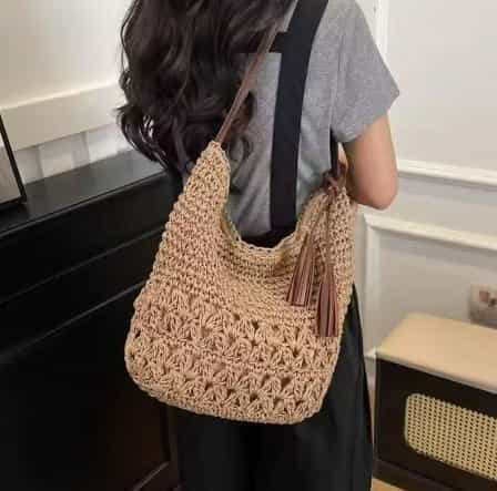
Terracotta – The Warm Earth Tone
This is where things get interesting.
Terracotta — think faded clay, burnt orange, and warm browns — is having a serious moment. Stella McCartney’s collection features “faded clay tones” that feel moodier and more sophisticated than traditional summer brights.
Why terracotta is trending:
- Feels premium – Richer than beige, more intentional
- Pairs well with neutrals – Works with white, cream, olive, and navy
- Fits the “quiet luxury” trend – Understated but distinctive
- Adds warmth – Complements summer skin tones beautifully
What to order: If you’re already stocking beige, terracotta is the natural next step. A bucket bag or structured tote in terracotta offers customers a color that feels fresh without being risky.
Pro tip: Look for terracotta with leather trims in complementary shades — deep brown or black work well.
What to Pair with Terracotta Raffia Bags
Terracotta works best when paired with the right colors. Here’s how to style it.
Colors that work with terracotta:
| Color | Why It Works | Best For |
|---|---|---|
| White/cream | Classic contrast — terracotta pops beautifully | Minimalist, clean looks |
| Olive green | Earthy and tonal — both colors ground each other | Natural, organic styling |
| Denim | Adds warmth to casual denim outfits | Casual, everyday |
| Navy/deep blue | Sophisticated contrast without being harsh | Workwear, smart-casual |
| Gold jewelry | Feels rich and premium together | Elevated, luxury looks |
What to avoid:
| What to Avoid | Why |
|---|---|
| Bright orange or red | Too much warmth — creates visual overwhelm |
| Neon colors | Terracotta is earthy — neon belongs in a different season |
Styling ideas for your product pages:
| Customer Profile | Suggested Pairing |
|---|---|
| Minimalist | Terracotta tote + white linen dress + gold sandals |
| Casual | Terracotta bucket bag + denim jeans + cream top |
| Office | Terracotta structured bag + navy trousers + silk blouse |
| Resort | Terracotta crossbody + cream cover-up + tan slides |
The bottom line: Terracotta isn’t hard to style — it works with colors your customers already wear. Show them how and they’ll buy.
How Terracotta Compares to Other Warm Tones – A Buyer’s Guide
Terracotta is often confused with other warm shades. Here’s how they differ and why it matters.
How terracotta compares to other warm tones:
| Shade | Description | Best For | Risk Level |
|---|---|---|---|
| Terracotta | Faded clay, warm brown-orange | Premium, grounded, quiet luxury | Low–Medium |
| Burnt orange | Stronger, more saturated | Statement pieces, festival style | Medium |
| Coral | Brighter, pinker undertones | Beach, resort, younger customers | Medium–High |
| Rust | Redder, deeper | Fall and winter | Medium |
| Cinnamon | Spicier, darker tone | Rich, autumnal looks | Low–Medium |
Why terracotta wins:
| Factor | Why Terracotta is the Better Choice |
|---|---|
| Versatility | Works in summer, fall, and transitional seasons |
| Longevity | Not a seasonal flash — customers carry it year-round |
| Perceived value | Feels more premium than brighter alternatives |
| Ease of styling | Pairs easily with neutrals |
| Customer appeal | Attracts intentional, high-value shoppers |
The bottom line: Terracotta is the safest entry into warm tones. It’s more versatile than burnt orange, more grounded than coral, and more year-round than rust. If you want to add warmth to your collection, start with terracotta.
How to Introduce Terracotta into Your Store – A Low-Risk Strategy
Adding terracotta doesn’t have to be a gamble. Here’s how to test it without overcommitting.
Low-risk ways to introduce terracotta:
| Strategy | How It Works | Why It’s Low-Risk |
|---|---|---|
| Start with one style | Add terracotta in your best-selling bag style | If it works, you know exactly what to scale |
| Test online first | List terracotta on your website before your physical store | Gauge demand without shelf space commitment |
| Small test order | Order 20–50 pieces | Limited exposure, easy to adjust |
| Bundle with neutrals | Promote terracotta alongside beige or cream | Customers see it as a complementary option |
| Style it clearly | Show how it works with existing wardrobe pieces | Reduces hesitation |
How to measure success:
| Success Indicator | What It Means | What to Do Next |
|---|---|---|
| Sold out in 2 weeks | High demand | Order 2–3x for next season |
| 50% sold in 4 weeks | Good demand | Reorder the same quantity |
| Slow movement | Low interest | Don’t reorder, try a different warm tone |
| Lots of customer questions | Interest but hesitation | Improve your styling and product photos |
The bottom line: You don’t need to go all-in on terracotta. Test small, measure results, and scale what works. A single style in a test order is enough to know if your customers are ready.
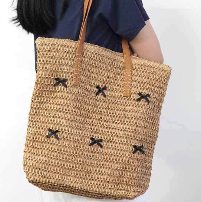
Olive – The Unexpected Neutral
Olive green might not be the first color you think of for summer. But it’s one of the most interesting trends in 2026.
Chloé’s Tea Leaf Green is a key option in their Summer Banana collection. And other brands are following suit with Grass Green and olive tones that feel fresh without being overly bright.
Why olive works:
- Unexpected but versatile – Reads as a neutral, not a statement
- Grounds summer outfits – Works with white, cream, beige, and denim
- Fits the “natural” story – Olive feels organic and earthy
- Differentiates your stock – Not every retailer will carry it
What to order: Olive works best in structured styles — totes, bucket bags, and shoulder bags. It feels less “beachy” than beige and more intentional.
Pro tip: Olive pairs exceptionally well with natural raffia textures and leather trims in brown or tan.
Who Buys Olive and Why
Olive attracts a specific type of customer. Here’s who it appeals to and why it works for them.
The olive customer profile:
- The minimalist – Olive reads as a neutral, not a color. It fits their pared-back wardrobe without adding visual noise.
- The nature lover – Olive feels organic and grounded. It appeals to customers who prioritize natural materials and earthy aesthetics.
- The style-conscious shopper – Olive is a signal that they follow trends, but without being flashy. It’s understated and intentional.
- The wardrobe builder – Olive works with their existing pieces — beige, cream, denim, navy, black. It’s an addition, not a replacement.
What olive customers are looking for:
- A bag that feels intentional, not random
- A color that works across multiple seasons
- A piece that gets compliments but doesn’t scream for attention
What they’re not looking for:
- Bright statement colors that only work for one season
- A bag that’s hard to style
- Something that feels trendy and disposable
The bottom line: Olive customers are more intentional shoppers. They take time to choose colors that work with their wardrobe. When you stock olive, they notice.
How to Style Olive Raffia Bags
Olive is versatile but unexpected. Here’s what it pairs with and how to style it.
Colors that work with olive:
| Color | Why It Works | Best For |
|---|---|---|
| White/cream | Clean contrast — olive pops against lighter tones | Minimalist, fresh looks |
| Beige/sand | Tonal, natural pairing | Earthy, organic styling |
| Denim | Casual, effortless | Everyday wear |
| Navy/black | Sophisticated and grounding | Workwear, evening |
| Terracotta | Earthy and warm — both feel grounded | Rich, intentional pairing |
Styling ideas for your product pages:
| Customer Profile | Suggested Pairing |
|---|---|
| Minimalist | Olive crossbody + white shirt + beige trousers |
| Casual | Olive bucket bag + denim + simple tee |
| Office | Olive structured tote + navy blazer + silk blouse |
| Trendsetter | Olive crochet bag + gold jewelry + neutral dress |
The bottom line: Olive pairs with almost every neutral. Show your customers how to style it — and they’ll buy it.
Why Olive Is a Smart Choice for Retailers
Olive is a safer bet than you might think. Here’s why it works for stores.
Why olive is a smart retail choice:
| Reason | Why It Matters |
|---|---|
| Differentiates your stock | Not every retailer carries olive — you stand out |
| Attracts intentional shoppers | Customers who choose olive are more thoughtful buyers |
| Works year-round | Olive transitions across seasons |
| Appeals to trendsetters | Fashion-forward customers want something different |
| Photos well | Olive looks great in lifestyle photography |
Risk vs. reward:
| Factor | Risk Level | Reward |
|---|---|---|
| Mass appeal | Medium — not as safe as beige | High — attracts trendsetters |
| Seasonal versatility | Low — works across seasons | High — sells year-round |
| Differentiation | Low — few retailers stock it | High — you stand out |
| Photogenic | Low — looks great in photos | High — social media appeal |
The bottom line: Olive is a low-risk differentiator. It’s not as safe as beige, but the customers who want it are more intentional and often willing to pay more. It’s a smart addition to any store that wants to offer something different.
How to Mix and Match Raffia Bag Colors in Your Store
Stocking the right color mix can increase sales. Here’s how to create a balanced color assortment that appeals to different customers.
Recommended color mix for a well-rounded store:
| Store Type | Recommended Mix | Why It Works |
|---|---|---|
| Boutique | 60% neutrals, 30% earth tones, 10% accent colors | Covers most customers, adds interest |
| Resort/Beach | 40% beige, 40% brights, 20% earth tones | Beach shoppers want color and variety |
| City/Office | 70% neutrals, 20% earth tones, 10% accent | Professional shoppers prefer subtle colors |
| Eco-conscious | 50% neutrals, 30% earth tones, 20% natural variations | Matches sustainable brand values |
How to group colors for visual appeal:
| Grouping Strategy | What to Do | Why It Works |
|---|---|---|
| Tonal display | Group similar shades together | Creates a cohesive, intentional look |
| Color block | Group by color family | Makes it easy for customers to find their color |
| Style+color | Show the same style in different colors | Customers see options side by side |
| Neutral+accent | Display neutrals with one accent color | Encourages customers to try something new |
The bottom line: The right color mix increases your chances of making a sale. Stock a balance of neutrals (beige), earth tones (terracotta, olive), and one accent color. This covers all customer preferences without overcomplicating your inventory.
Quick Comparison – 2026 Raffia Bag Color
| Color | Best For | Risk Level | Best Style | Why Customers Love It |
| Beige | Everyday, all customers | Low | Structured tote | Timeless, versatile |
| Terracotta | Fashion-forward shoppers | Low–Medium | Bucket bag | Warm, premium feel |
| Olive | Differentiated stock | Medium | Shoulder bag | Unexpected but wearable |
What to order: Beige is the safe bet. Terracotta is the natural upgrade. Olive is the differentiator. If you’re ordering multiple styles, consider one of each to cover all customer segments.
Wrapping it Up
Raffia bags in 2026 are more interesting than ever. The color palette has expanded beyond natural beige to include warm terracotta, olive green, and other earthy tones that feel fresh and intentional.
For wholesale buyers, this means opportunity. Stocking a range of colors lets you appeal to different customer segments — from the classic shopper who wants beige to the fashion-forward customer looking for something different.
Ready to stock 2026’s top raffia bag colors?
Contact Rafico Accessories for a custom raffia bag quote or wholesale pricing. We’ll help you find the right colors and styles for your summer collection.